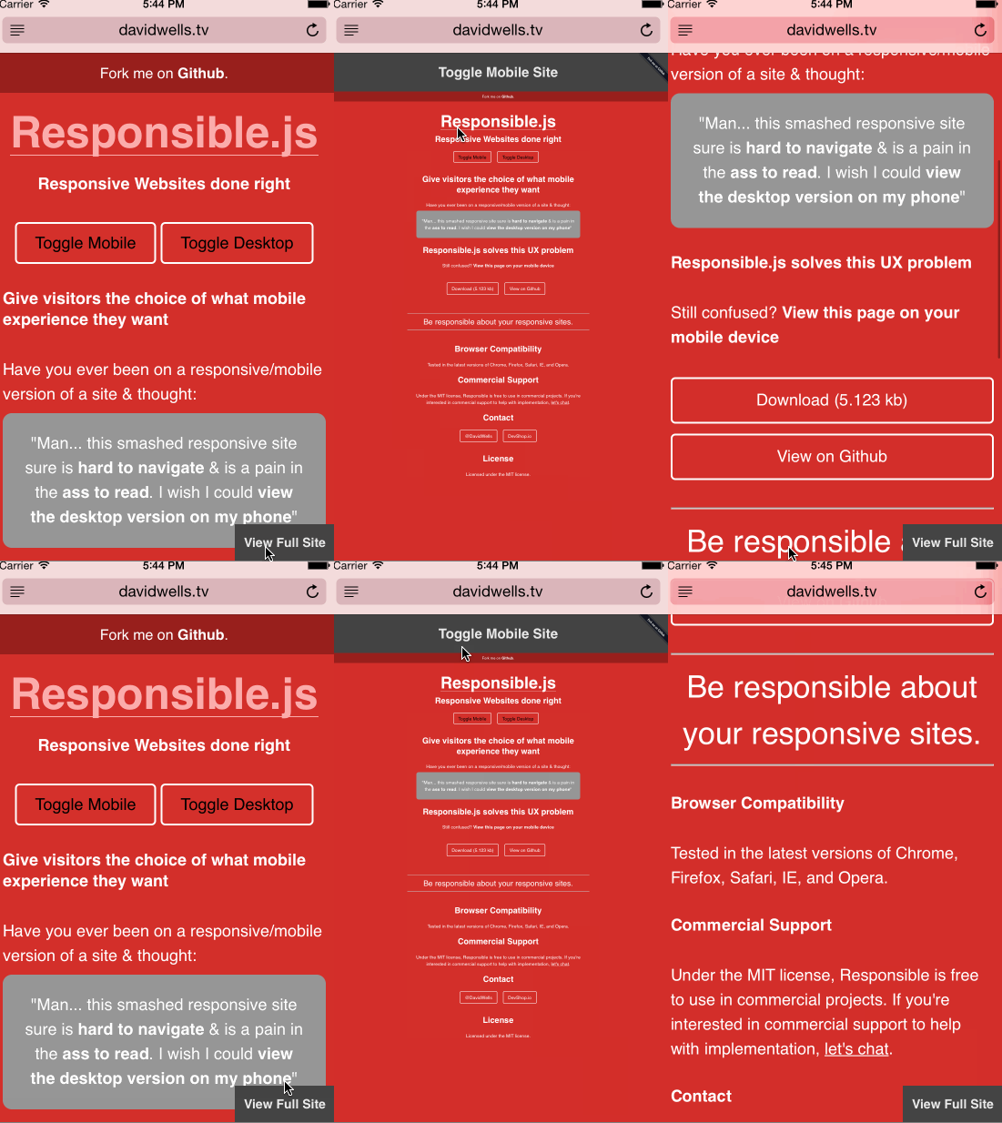
Preface: this post isn’t against responsive design, far from it. It’s about fixing the glaring User experience issues faced on most responsive sites.
Lets face it responsive sites can be really, really, really shitty. How many times have you been on your phone, clicked through a link on twitter only to see a smashed bullshit responsive design? It’s hard to read, it’s unfamiliar, it’s a pain to scroll, and it’s might be hellaciously ugly. It doesn’t need to be this way. Why not give visitors the choice of what type of mobile experience they would like with your site?
Why?
UX Problems with responsive sites:
- Users might be used to the desktop experience & the responsive layout is frustrating to re-learn
- Text is harder to read because there are like 4 words per line
- Scroll hell - Touch scrolling over and over and over to get to where you want to go
- Design limitations - typically desktop views of marketing sites look far superior
- New unfamiliar mobile navigation
- No one knows what a hamburger menu is… still…
- etc
Not all responsive sites are created equally, some are great and do a fantastic job of addressing these issues. The other 99% of the internet with shit responsive sites is what we are addressing. Why not solve all of these issues with responsive sites with one simple trick?
Introducing Responsible.js
The plague of shitty responsive sites has been nagging at me for a while now. I decided to take a stab at fixing the issue by creating responsible.js. https://www.youtube.com/watch?v=VtSvk8xnmBE  Responsible.js is a pretty simple trick turned into a lightweight javascript module.
How does it work?
All it does is deactivate the responsive CSS on the website and reset the device viewport with javascript when the visitor opts for the desktop version of the site. That’s it. What this allows for is a seamless user experience switching from a mobile view to the normal desktop view of the site. No page reloads, no crazy shenanigans, just a good user experience .
Give Visitors a better experience
People deserve the ability to choose how they wish to consume your website. If they want to view the mobile responsive version, let them. (it’s the default behavior) If they want to view the desktop version of the site, let them. Some folks don’t mind pinching and zooming to have a desktop like mobile experience. The ones that do care, they simply use the default mobile view.
View the Demo here
Open demo on mobile device or emulate mobile on devtools.
Whats the catch?
Aha, there is one catch! To get this working, you will need to separate your responsive CSS into a separate file. So any mediaQuery targeting a mobile device, you would place into a new css file (responsive.css) This might require some additional build steps for ya, but the UX gain is crazy awesome.
Pull Requests Welcome
I open sourced the library on Github. Feel free to fork and contribute.